For 73 years, the United States Constitution held together, crudely, like a quilt of bandaids, all of the piles of compromises that were required to keep petulant slave states happy. After the Civil War, the thing should have been rewritten completely and all the structural compromises which had been designed to placate the slave states should have been removed. Coulda-woulda-shoulda.
It has now gotten to the point where the American system of government is one of the biggest problems facing the country. The 21st Century moves fast, and yet America has an 18th Century operating system. We are increasingly unable to keep up with the world. The last two decades have essentially been lost to idiotic gridlock and the classic “land war in Asia” blunder. We cannot afford any more lost decades.
How should we fix the Constitution? As a thought experiment, what if we work the problem from a new angle: our map. The map is a visual representation of some concepts in the Constitution. What if we imagine a new, better map in order to see the corresponding change to the Constitution? What is the problem with our current map? There are several:
The shape of our states are a product of conflicting land grants from foreign powers, long-forgotten political battles, actually deadly battles, historical oddities, and antique surveying equipment. States are gerrymandered just as badly as House districts, but they don’t have the benefit of being redrawn after every census. According to the Constitutional Convention, State lines and especially House district lines are supposed to represent a slippery notion of “communities of interest.”
If we could do this all again we would surely map ourselves differently. Where would the borders be? Using data from wheresgeorge.com, where users tracked the movement of dollar bill serial numbers, we can see the border lines of America’s micro-economies. The thicker the line, the less likely a dollar bill crosses it:

Any new state maps should respect these boundaries that we have made ourselves. Like this wheresgeorge.com experiment, the map of our money. OKCupid.com maps America according to every preference imaginable. Are some of these lines thick enough to become state lines?
Well, consider this, the map of our ideology: This map reflects many different types of maps—including maps showing the county-by-county distribution of linguistic dialects, the spread of cultural artifacts, and the prevalence of different religious denominations. Our continent’s famed openness and mobility has actually been reinforcing regional differences, not dissolving them, as people increasingly sort themselves into like-minded communities:

In a perfect world, we would rethink the Senate and the states without regard for political entrenchment. We would use social sciences like those reflected in the 11 American Nations map above. Or we could use more hard sciences like hydrology…
This next map is a water map. Back in the 1800s, the Director of the U.S. Geological Survey proposed that we divvy up western states based on watersheds. There’s sound logic there. Much of the west is arid, and human civilization is going to come down to everyone freaking out about water eventually, yet our arbitrary land grants were horribly implemented with a pencil and a straight-edge ruler. If we bothered to ask the Earth, she would say the actual regions of the west look more like this:

Each color is a the drainage area of a different river system. But that is a lot of states for a big, mostly empty space. Which raises a key question: How many states should we have? How many legislative chambers? Should we have 545 states with Wyoming-sized populations so the Senate is finally geographically representative? Should large states remain underrepresented in the Electoral College? Or should there be no Electoral College? Should there be no Senate? Should there be 50 states, or fewer?
There are other maps that visualize the clusters of sports fans. But that’s basically a map of major American cities and the occasional region. There happen to be 38 of those clusters.

The 38-states mapmaker gave high priority to population density, location of cities, topography, and lines of transportation to determine the shape of individual States. Borders are located in less populated areas because each state surrounds one of the 38 population centers in America.
Another mapmaker redrew the 50 states to have equal population so that the undemocratic Senate would be as democratic as the House.

Then again, why even have a Senate? That was a compromise designed to slow the country down and placate slave states. Perhaps in a perfect world, we’d abolish the Senate.
Ever since the Supreme Court began gutting the Voting Rights Act, I’m beginning to favor algorithmically generated House districts. The Voting Rights Act had previously tried to require that states draw majority-minority districts to ensure that minority voters get appropriate representation in Congress.
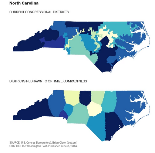
But as we see in North Carolina’s 12th District above, gerrymandering often packs a state’s minority voters into a small number of districts so as to diminish their clout everywhere else. One superhero computer programmer did all the states this way – i.e. “fairly.”
Germany is a smaller, better-managed country than the U.S. and they have 620 seats in their legislature. A democracy with a population closest to the U.S. is Indonesia and they have 560 seats in theirs. Brazil is slightly smaller and they have 513. So what if we go from 435 to 500 house seats, allow the districts to form 38 Regional “working groups,” and we completely abolish the Senate? How about that?
Do I think any of this will happen? No. We can’t have nice things. But still, this is a fun political science thought experiment. I like asking big questions and wrestling with the repercussions.